pacman::p_load(shiny, tidyverse, dplyr,
               plotly,ggplot2,ggthemes,
               knitr, vcd, readr, ggstatsplot,
lubridate, ggiraph, patchwork)Armed Conflicts in Myanmar - Prototype
Confirmatory Data Analysis
The following page will run through the various steps on how to prepare the dataset to conduct Confirmatory Data Analysis (CDA).
1. Installing and Launching the Required R Packages
We will load the following packages by using the pacman::p_load function:
Shiny
Tidyverse
dplyr
vcd
ggplot2
ggstatplot
readr
ggthemes
plotly
knitr
lubridate
ggirafe
patchwork
2. Loading the Datasets
The main dataset that will be used is ACLED_MMR. This dataset is obtained from the ACLED website which allows the selection of just extracting the particular country for our study - Myanmar.
ACLED_MMR <- read_csv("data/MMR.csv")3. Data Overview
The dataset contains a total of 35 variables and 57,198 rows.
ACLED_MMR# A tibble: 57,198 × 35
event_id_cnty event_date year time_precision disorder_type event_type
<chr> <chr> <dbl> <dbl> <chr> <chr>
1 MMR58558 16 February 2024 2024 1 Political vio… Battles
2 MMR58559 16 February 2024 2024 1 Political vio… Battles
3 MMR58443 16 February 2024 2024 2 Political vio… Violence …
4 MMR58502 16 February 2024 2024 1 Political vio… Violence …
5 MMR58507 16 February 2024 2024 1 Political vio… Explosion…
6 MMR58508 16 February 2024 2024 1 Political vio… Explosion…
7 MMR58547 16 February 2024 2024 1 Strategic dev… Strategic…
8 MMR58560 16 February 2024 2024 1 Political vio… Battles
9 MMR58589 16 February 2024 2024 2 Political vio… Violence …
10 MMR58648 16 February 2024 2024 1 Political vio… Explosion…
# ℹ 57,188 more rows
# ℹ 29 more variables: sub_event_type <chr>, actor1 <chr>, assoc_actor_1 <chr>,
# inter1 <dbl>, actor2 <chr>, assoc_actor_2 <chr>, inter2 <dbl>,
# interaction <dbl>, civilian_targeting <chr>, iso <dbl>, region <chr>,
# country <chr>, admin1 <chr>, admin2 <chr>, admin3 <chr>, location <chr>,
# latitude <dbl>, longitude <dbl>, geo_precision <dbl>, source <chr>,
# source_scale <chr>, notes <chr>, fatalities <dbl>, tags <chr>, …3.1 Converting Data Types
There are 2 fields that need to correct the data types, event_date and year. event_date will be converted to dmy format and year will be converted to factor. The following code chunk is used:
ACLED_MMR <- ACLED_MMR %>%
  mutate(year =factor(year))

ACLED_MMR$event_date <- dmy(ACLED_MMR$event_date)
3.2 Removing of Unused Columns
After reviewing the data, a few of the columns will not be used as they do not seem suitable for the analysis. The code chunk below removes these columns:
ACLED_MMR <- ACLED_MMR %>%
  select(-time_precision, -geo_precision, -source_scale, -timestamp, -tags)
3.3 Creating Subsets of the Dataset
The following subsets of the Dataset is created for the various CDA sections in the later part:
Summary_Data <- ACLED_MMR %>%
    group_by(year, event_type) %>%
    summarise(Total_incidents = n(),
              Total_Fatalities = sum(fatalities, na.rm=TRUE)) %>%

    ungroup()
Summary_Data_Region <- ACLED_MMR %>%
group_by(admin1, event_type) %>%
summarise(Total_incidents = n(),
Total_Fatalities = sum(fatalities, na.rm=TRUE)) %>%
ungroup() ACLED_MMR_Mosaic <- ACLED_MMR %>%
group_by(event_id_cnty,year, country, admin1,event_type, sub_event_type, fatalities) %>%
summarize(
Has_Fatalities = ifelse(fatalities > 0, "Has Fatalities", "No Fatalities")
) %>%
ungroup()Region_Summary <- ACLED_MMR %>%
group_by(country, admin1, admin2, admin3, event_type,sub_event_type, disorder_type) %>%
summarize(
Total_incidents = n(),
Total_Fatalities = sum(fatalities, na.rm=TRUE)
)4. Exploratory Data Analysis
4.1 Distribution of Incidents Across Years by event_type
The following code below shows the distribution of incidents according to event type across 2010 to 2023.
Note
Hover on the bars to see details.
Summary_Data$tooltip <- c(paste0(
  " Year = ", Summary_Data$year,
  "\n Total Fatalities = ", Summary_Data$Total_incidents))

gg1 <- ggplot(Summary_Data,
       aes(x = year,
           y = Total_incidents,
           fill = event_type)) +
  geom_col_interactive(aes(tooltip = Summary_Data$tooltip,
                           data_id = year),
                       alpha = 0.5) +
  facet_wrap(~event_type,
             ncol =2,
             scales = "free") +
  theme_minimal() +
  labs(y = "Total Number of Incidents", x = "Years") +
  theme(
    panel.grid.major.y = element_line(color = "pink", linetype = 2),
    strip.background = element_rect(fill = "black"),
    axis.text.x = element_blank(),
    strip.text = element_text(colour = "white"),
    legend.position = "none")

girafe(
  ggobj = gg1,
  width_svg = 6,
  height_svg = 6*0.618)
Chart Analysis
From the chart above, it can be seen that there was a spike in incidents from 2021 onwards, these increase in incidents coincide with the period of civil unrest within Myanmar.
4.2 Distribution of Fatalities Across Years by event_type
The code below shows the distribution of the fatalities from 2010 to 2023 according to the event type.
Note
Hover on the bars to see details.
Summary_Data$tooltip <- c(paste0(
  " Year = ", Summary_Data$year,
  "\n Total Fatalities = ", Summary_Data$Total_Fatalities))

gg2 <- ggplot(Summary_Data,
       aes(x = year,
           y = Total_Fatalities,
           fill = event_type)) +
  geom_col_interactive(aes(tooltip = Summary_Data$tooltip,
                           data_id = year),
                       alpha = 0.5) +
  facet_wrap(~event_type,
             ncol =2,
             scales = "free") +
  theme_minimal() +
  labs(y = "Total Number of Fatalities", x = "Years") +
  theme(
    panel.grid.major.y = element_line(color = "pink", linetype = 2),
    strip.background = element_rect(fill = "black"),
    strip.text = element_text(colour = "white"),
    axis.text.x = element_blank(),
    legend.position = "none")

girafe(
  ggobj = gg2,
  width_svg = 6,
  height_svg = 6*0.618)
Chart Analysis
From the chart above, there was an increase fatalities from battles, explosions/remote violence and violence against civilians from 2021 onwards. This could be correlate to the increase in incidents caused by the civil unrest in Myanmar from that period onwards.
4.3 Distribution of Incidents by Region
The code below shows the distribution of incidents according to each individual region within Myanmar. When you hover on each bar, it would highlight the region within each event type.
Note
Hover on the bars to see details.
Summary_Data_Region$tooltip <- c(paste0(
  " Region = ", Summary_Data_Region$admin1,
  "\n Total Fatalities = ", Summary_Data_Region$Total_incidents))

gg3 <- ggplot(Summary_Data_Region,
       aes(x = admin1,
           y = Total_incidents,
           fill = event_type)) +
  geom_col_interactive(aes(tooltip = Summary_Data_Region$tooltip,
                           data_id = Total_incidents),
                       alpha = 0.5) +
  facet_wrap(~event_type,
             ncol =2,
             scales = "free") +
  theme_minimal() +
  labs(y = "Total Number of Incidents", x = "Regions") +
  theme(
    panel.grid.major.y = element_line(color = "pink", linetype = 2),
    axis.text.x = element_blank(),
    strip.background = element_rect(fill = "black"),
    strip.text = element_text(colour = "white"),
    legend.position = "none")

girafe(
  ggobj = gg3,
  width_svg = 6,
  height_svg = 6*0.618)
Chart Summary
From the chart above, it can be seen that Sagaing has the most incidents across all types of events compared to the other regions, however, Shan-North has the highest amount of battles. There could also be a correlation that with the increase of strategic developments within that region, it could lead to the increase of protests and battles.
4.4 Distribution of Fatalities by Region
The code below shows the distribution of fatalities according to each individual region within Myanmar. When you hover on each bar, it would highlight the region within each event type.
Note
Hover on the bars to see details.
Summary_Data_Region$tooltip <- c(paste0(
  " Region = ", Summary_Data_Region$admin1,
  "\n Total Fatalities = ", Summary_Data_Region$Total_Fatalities))


gg4 <- ggplot(Summary_Data_Region,
       aes(x = admin1,
           y = Total_Fatalities,
           fill = event_type)) +
  geom_col_interactive(aes(tooltip = Summary_Data_Region$tooltip,
                           data_id = admin1),
                       alpha = 0.5) +
  facet_wrap(~event_type,
             ncol =2,
             scales = "free") +
  theme_minimal() +
  labs(y = "Total Number of Fatalities", x = "Regions") +
  theme(
    panel.grid.major.y = element_line(color = "pink", linetype = 2),
    axis.text.x = element_blank(),
    strip.background = element_rect(fill = "black"),
    strip.text = element_text(colour = "white"),
    legend.position = "none")

girafe(
  ggobj = gg4,
  width_svg = 6,
  height_svg = 6*0.618)
Chart Analysis
From the chart above, the number of fatalities in battle seem to be correlated with the number of incidents. But it seems that it may not be the case for explosions/remote violence as shown for the region of Sagaing where there are a higher amount of explosions/remote violence however the fatalities are a lot lower.
5. One-Way Anova Testing: Event Types & Fatatilites
The following code chunk below is used for Anova Testing of the types of events against the number of fatalities.
ACLED_ANOVA_Filtered <- ACLED_MMR %>%
filter(year == 2022)ggbetweenstats(ACLED_ANOVA_Filtered,
x = event_type,
y = fatalities,
type = "np",
pairwise.display = "s",
pairwise_comparisons = TRUE,
output = "plot")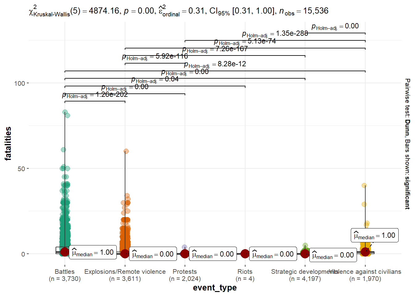
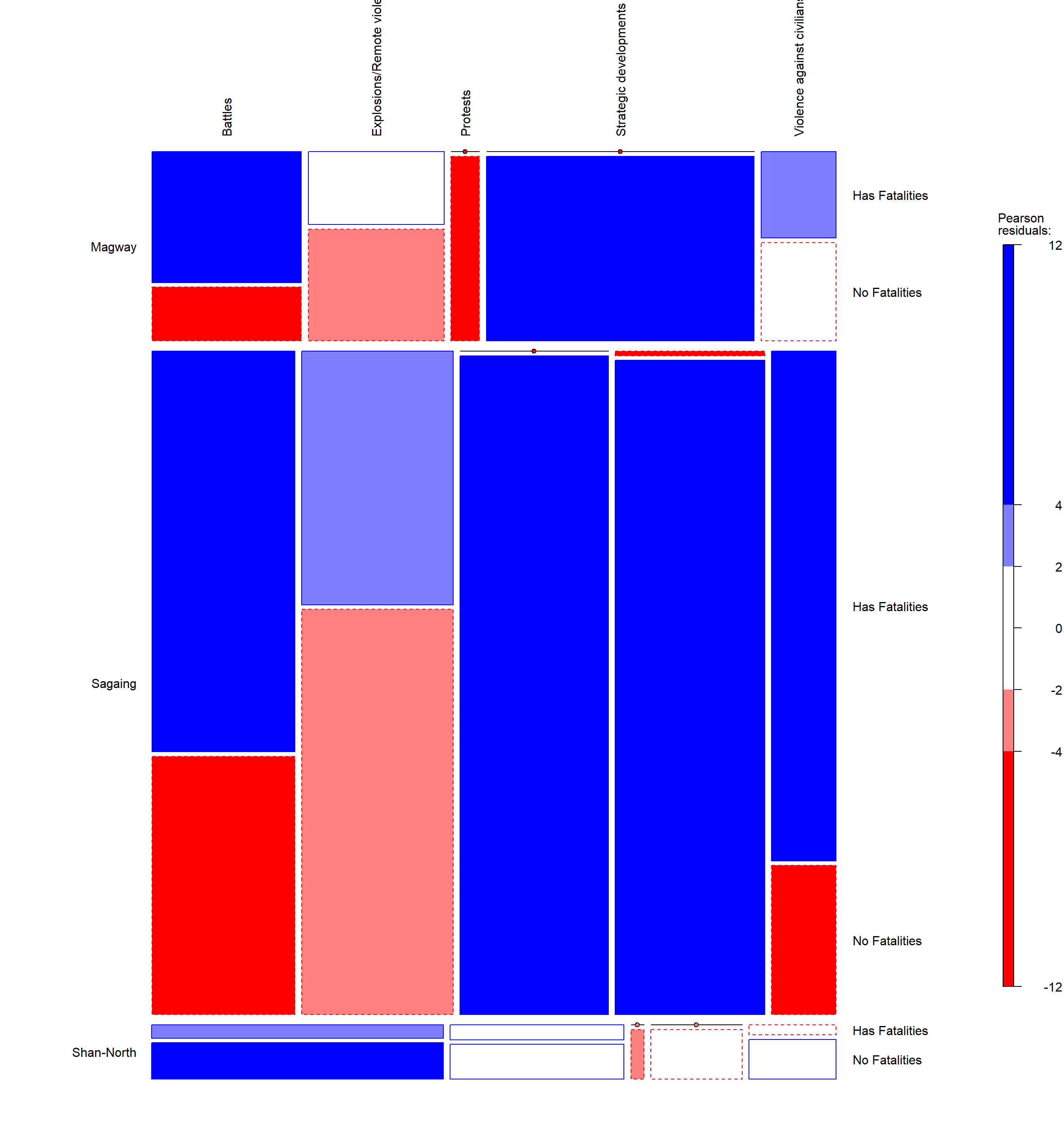
6. Mosaic Plot : Region and Event Types
The following code chunk makes use of the mosaic plot function in the vcd package. The mosiac plot function provides a visual relationship between the various variables selected. The larger the box area, the more incidents that it has based on those categories. The colors in the various plot represent the Pearson Coefficient shown on the right of the plot.
ACLED_MMR_Mosaic_Filtered <- ACLED_MMR_Mosaic %>%
  filter(year == 2021, admin1 == c("Sagaing", "Magway", "Shan-North"))


vcd::mosaic(~ admin1 + event_type + Has_Fatalities, gp=shading_Friendly, data = ACLED_MMR_Mosaic_Filtered, labeling = labeling_border(varnames = FALSE, rot_labels = c(90,0,0,0),
                                       just_labels = c("left",
                                                 "left",
                                                 "center",
                                                 "right")
                                 ),
            margins = c(10,10,4,10))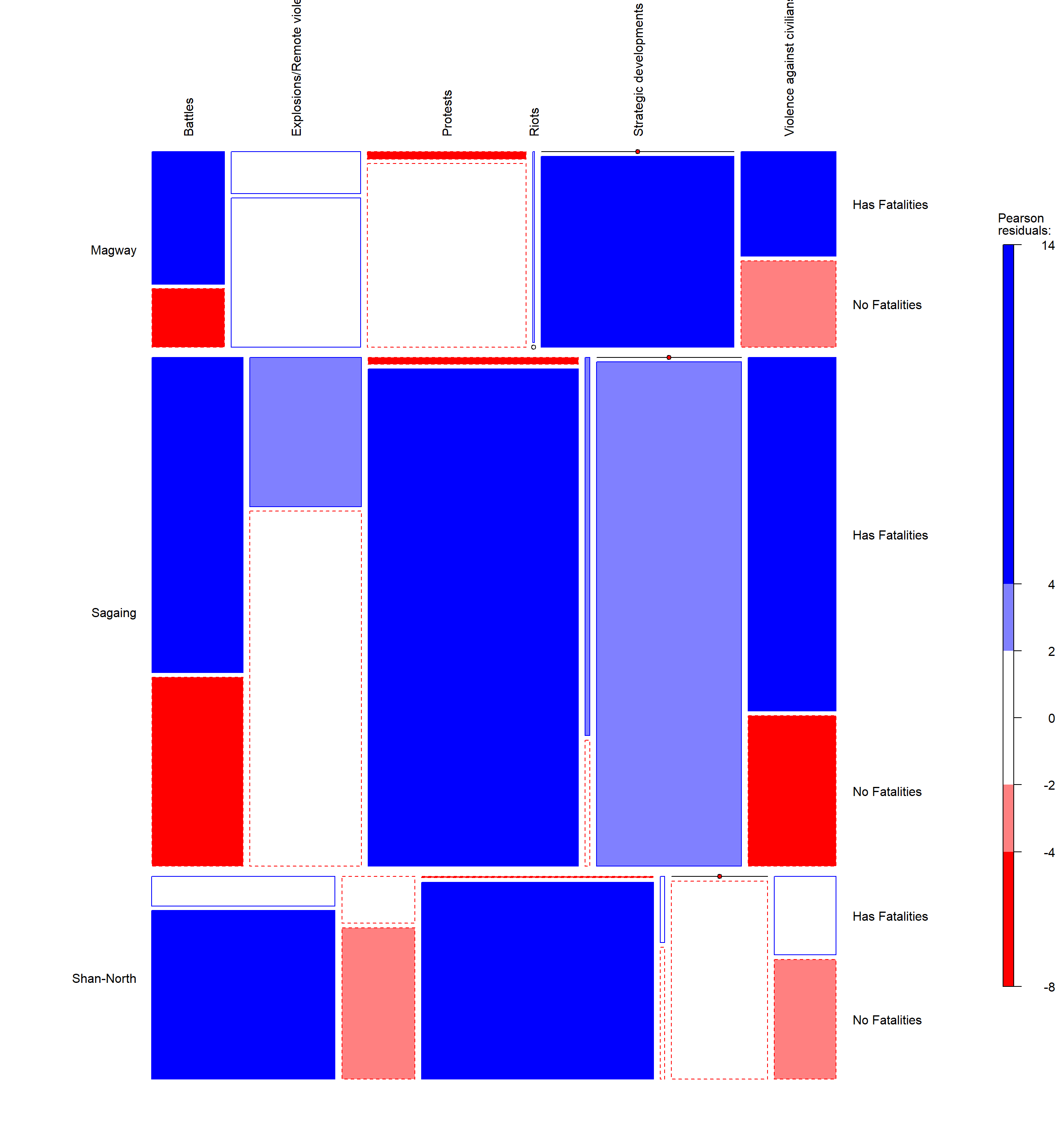
ACLED_MMR_Mosaic_Filtered <- ACLED_MMR_Mosaic %>%
  filter(year == 2022, admin1 == c("Sagaing", "Magway", "Shan-North"))


vcd::mosaic(~ admin1 + event_type + Has_Fatalities, gp=shading_Friendly, data = ACLED_MMR_Mosaic_Filtered, labeling = labeling_border(varnames = FALSE,rot_labels = c(90,0,0,0),
                                       just_labels = c("left",
                                                 "left",
                                                 "center",
                                                 "right")
                                 ),margins = c(10,10,4,10)
            )
ACLED_MMR_Mosaic_Filtered <- ACLED_MMR_Mosaic %>%
  filter(year == 2023, admin1 == c("Sagaing", "Magway", "Shan-North"))


vcd::mosaic(~ admin1 + event_type + Has_Fatalities, gp=shading_Friendly, data = ACLED_MMR_Mosaic_Filtered, labeling = labeling_border(varnames = FALSE, rot_labels = c(90,0,0,0),
                                       just_labels = c("left",
                                                 "left",
                                                 "center",
                                                 "right")
                                 ),
            margins = c(10,10,4,10)
            )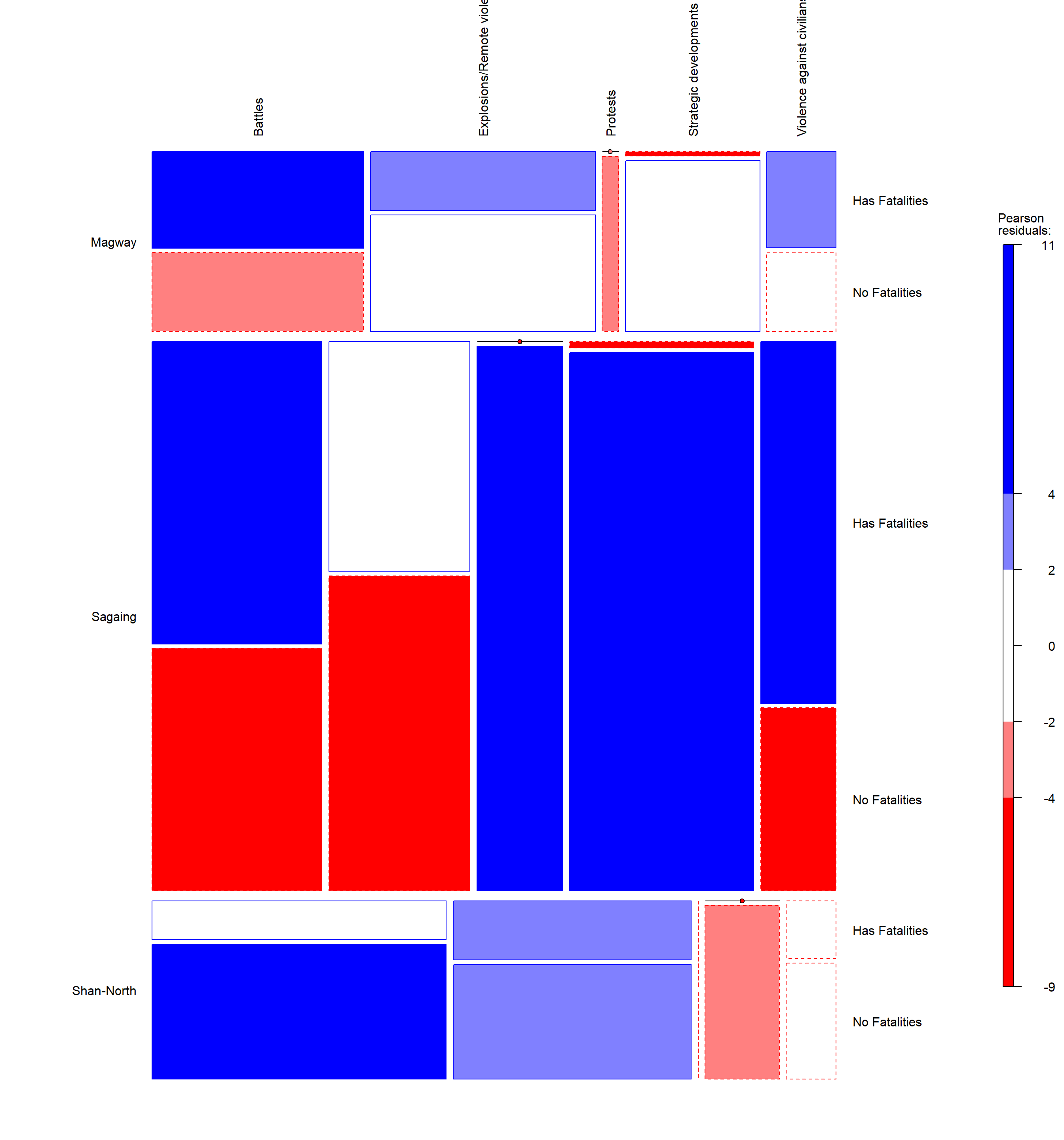
Chart Analysis
Based on the earlier EDA and geospatial analysis from the previous section, it was mentioned that there seems to be correlation between the increase in incidents between Sagaing, Magway and Shan-North. To further understand on this correlation, the above mosaic plots was split according from 2021 to 2023 to show the relationships between the three regions, event types and whether they have fatalities or not.
The following can be summarized from the various charts above:
Sagaing across the three years has the highest number of incidents, particularly in battles and strategic developments.
For all incidents under strategic developments, majority have no fatalities.
Shan-North has had constantly higher number of battles compared to the other two regions, however majority of them have no fatalities. Although the other two regions have lesser battles, they have more fatalities.
For all incidents under explosions/remote violence, majority of them have no fatalities.
Riots only occured in 2021 and has more fatalities compared to other event types except for the region of Shan-North
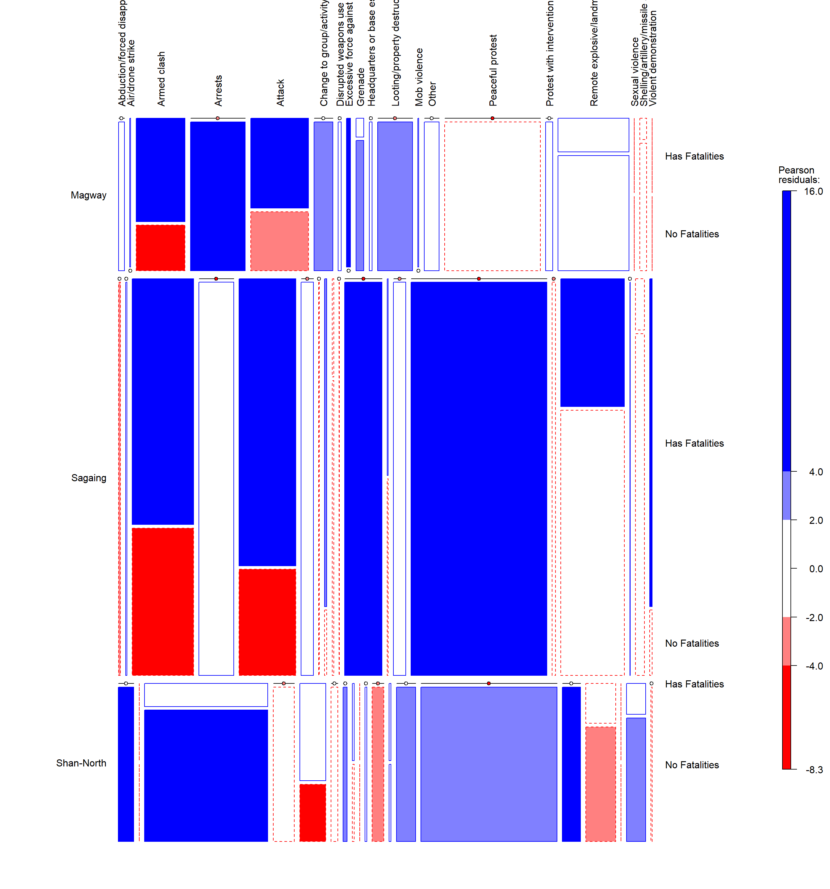
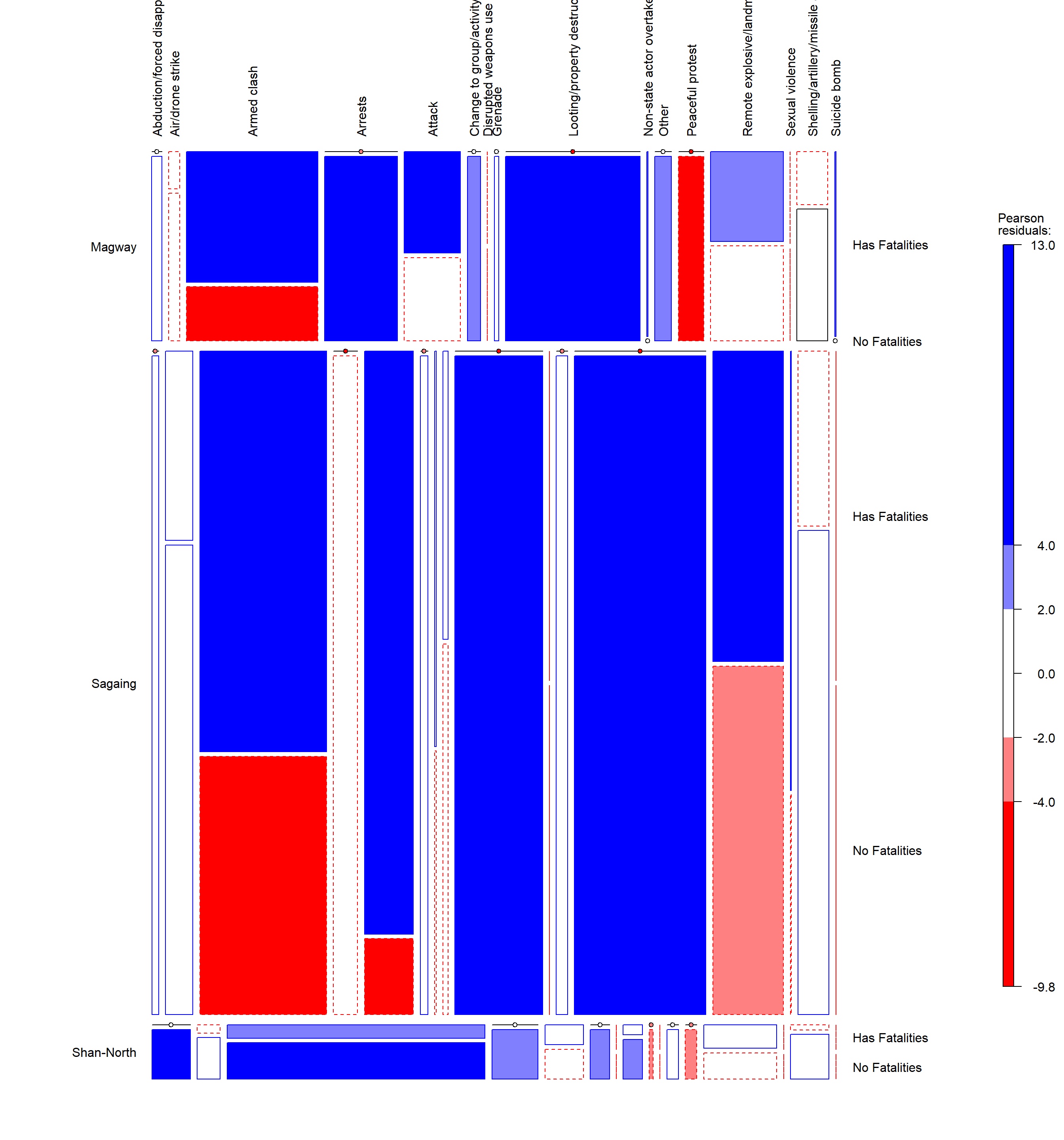
7. Mosaic Plot: Into Finer Details
Based on the earlier mosaic plot and summary, we can further delve into the analysis by further breaking down the various event types into sub event types to better understand the details. The codes below would use the same filters and changing the event type variable to sub event type.
ACLED_MMR_Mosaic_Filtered <- ACLED_MMR_Mosaic %>%
  filter(year == 2021, admin1 == c("Sagaing", "Magway", "Shan-North"))


vcd::mosaic(~ admin1 + sub_event_type + Has_Fatalities, gp=shading_Friendly, data = ACLED_MMR_Mosaic_Filtered, labeling = labeling_border(varnames = FALSE,
                                                      rot_labels = c(90,0,0,0),
                                       just_labels = c("left",
                                                 "left",
                                                 "center",
                                                 "right")
),
margins = c(10,10,4,10)
)
ACLED_MMR_Mosaic_Filtered <- ACLED_MMR_Mosaic %>%
  filter(year == 2022, admin1 == c("Sagaing", "Magway", "Shan-North"))


vcd::mosaic(~ admin1 + sub_event_type + Has_Fatalities, gp=shading_Friendly, data = ACLED_MMR_Mosaic_Filtered, labeling = labeling_border(varnames = FALSE,
                                                      rot_labels = c(90,0,0,0),
                                       just_labels = c("left",
                                                 "left",
                                                 "center",
                                                 "right")
),
margins = c(10,10,4,10)
)
ACLED_MMR_Mosaic_Filtered <- ACLED_MMR_Mosaic %>%
  filter(year == 2023, admin1 == c("Sagaing", "Magway", "Shan-North"))


vcd::mosaic(~ admin1 + sub_event_type + Has_Fatalities, gp=shading_Friendly, data = ACLED_MMR_Mosaic_Filtered, labeling = labeling_border(varnames = FALSE,
                                                      rot_labels = c(90,0,0,0),
                                       just_labels = c("left",
                                                 "left",
                                                 "center",
                                                 "right")
),

margins = c(10,10,4,10)
)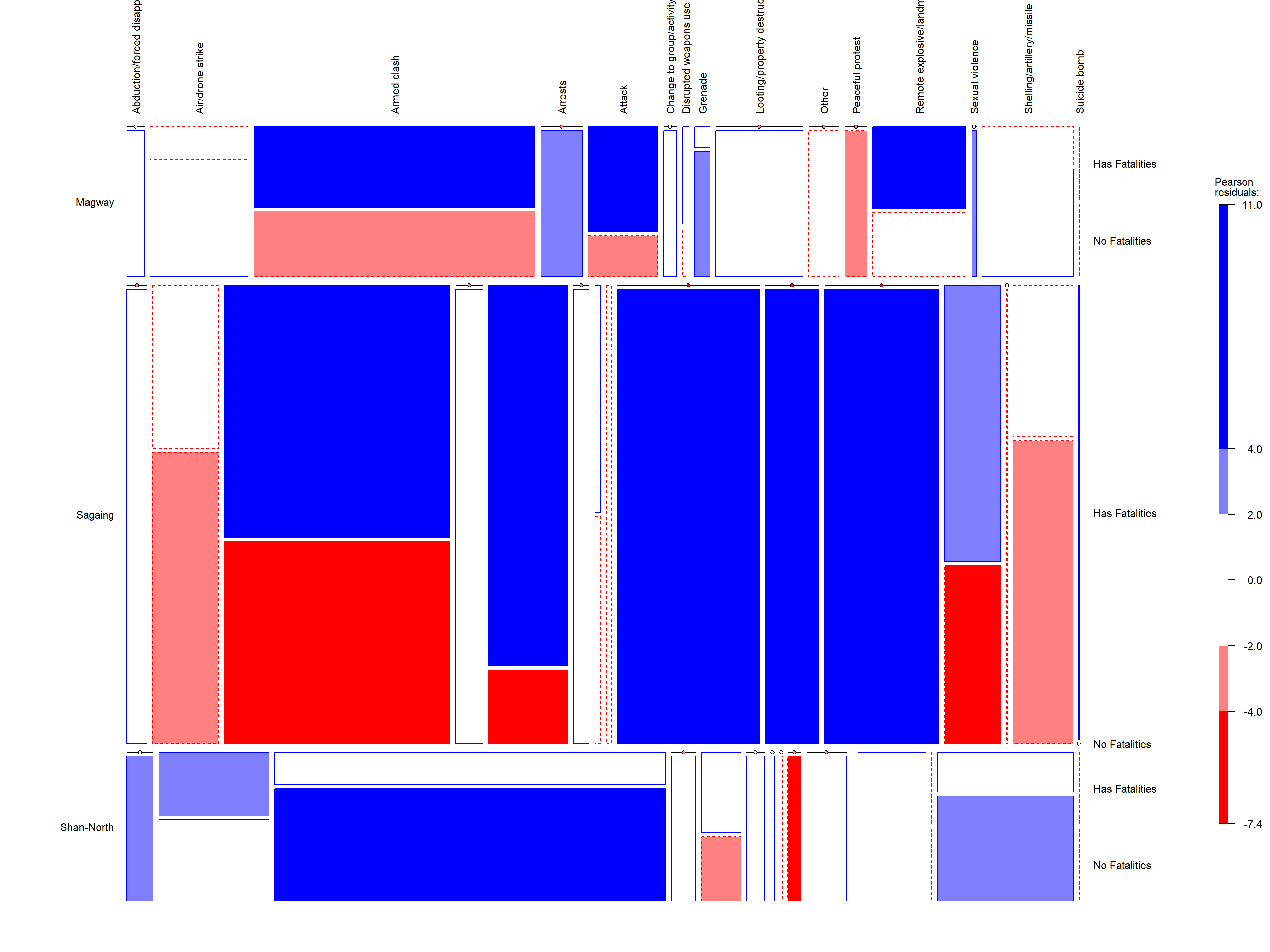
Chart Analysis
Based on the sub event types, the following analysis can be summarized:
There was an increase in armed clashes from 2021 to 2023 and there were more fatalities in Magway and Sagaing as compared to Shan-North.
Compared to Sagaing and Magway, majority of the incidents that occured in Shan-North resulted in no fatalities.
From 2021 to 2023, Sagaing’s strategic developments events reduced in the number of peacful incidents and increased in looting.
The total number of incidents with fatalities increased from 2021 to 2023.